Essency

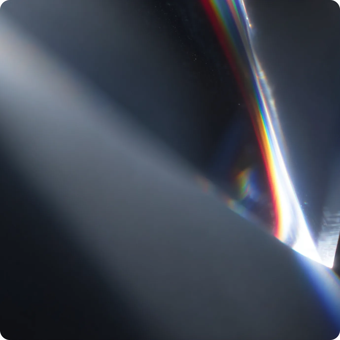
Dark background crossed by warm prismatic light leaks

A brand to match the level of the thinking.

Essency is a Portuguese consulting firm working on strategic clarity, growth, reputation, and customer experience for senior teams. They had a strong point of view and a deep library of content, but no identity of their own. The site ran on a generic WordPress template, and The Power Triangle, their proprietary methodology, lived only in slides.

Details

Client

Essency Consulting

Role

Branding Strategy and Digital Identity

Timeframe

2023-2025

Brand Design
This is some text inside of a div block.

Identity & Visual language

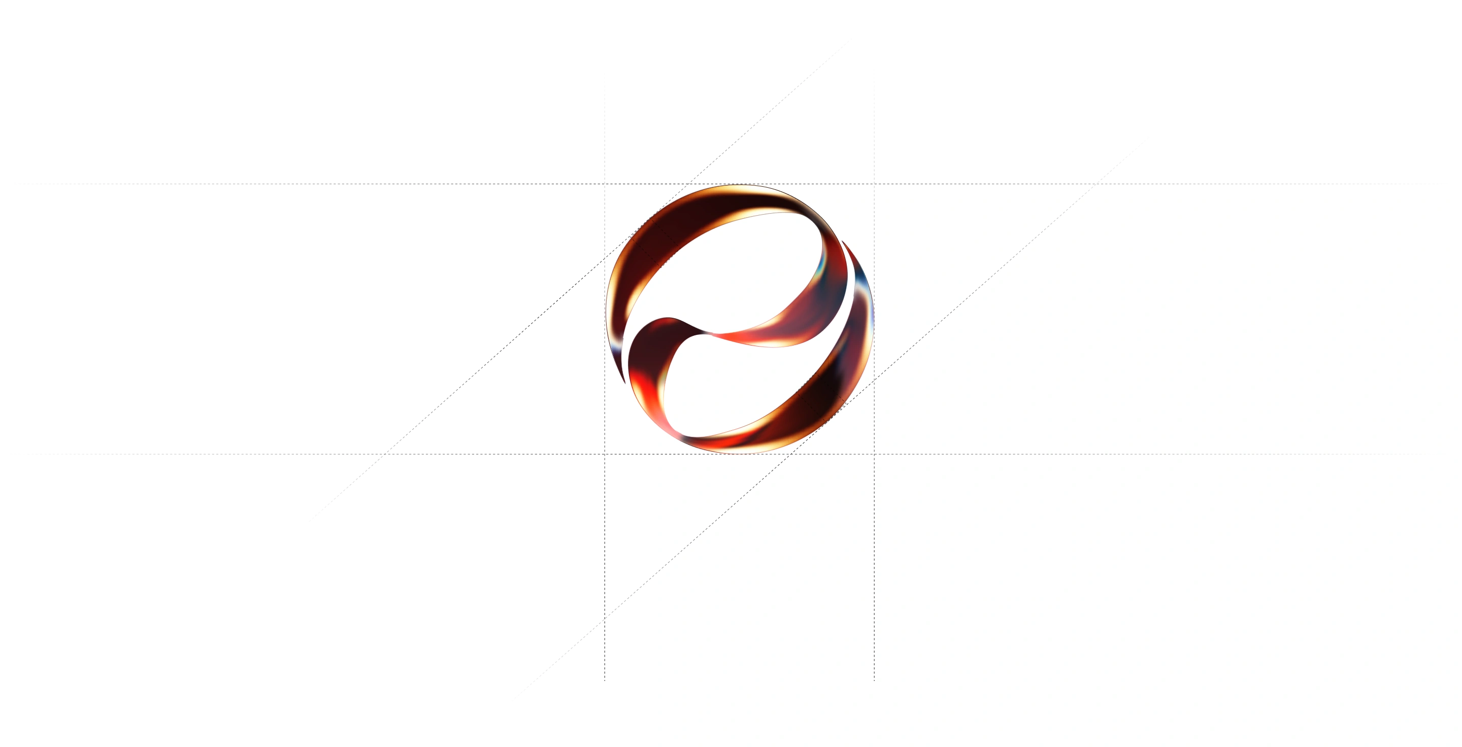
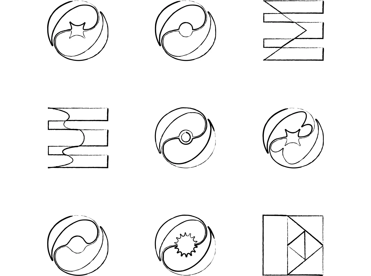
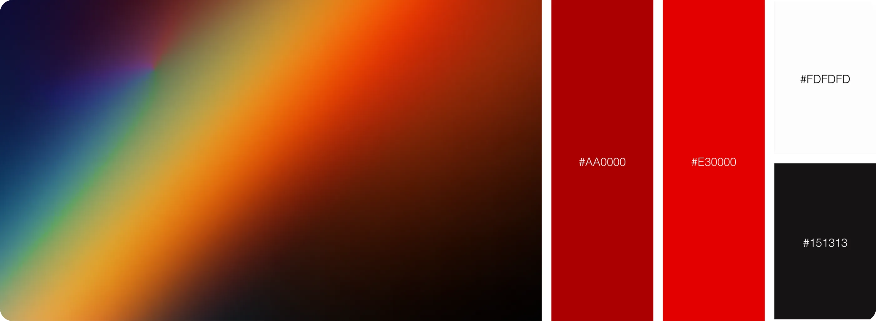
The brand had no mark of its own. We designed the Essency mark as a single continuous form, translating the brand's name and philosophy into a simple, self-contained symbol. Its flowing structure expresses clarity, continuity and ideas in constant evolution. It pairs with a sans-serif wordmark, and red, white, and black run across the logo, the site, and the presentations.

Essency's continuous mark rendered in 3D with refracted warm light
This is some text inside of a div block.

One idea holds the whole system together: light.

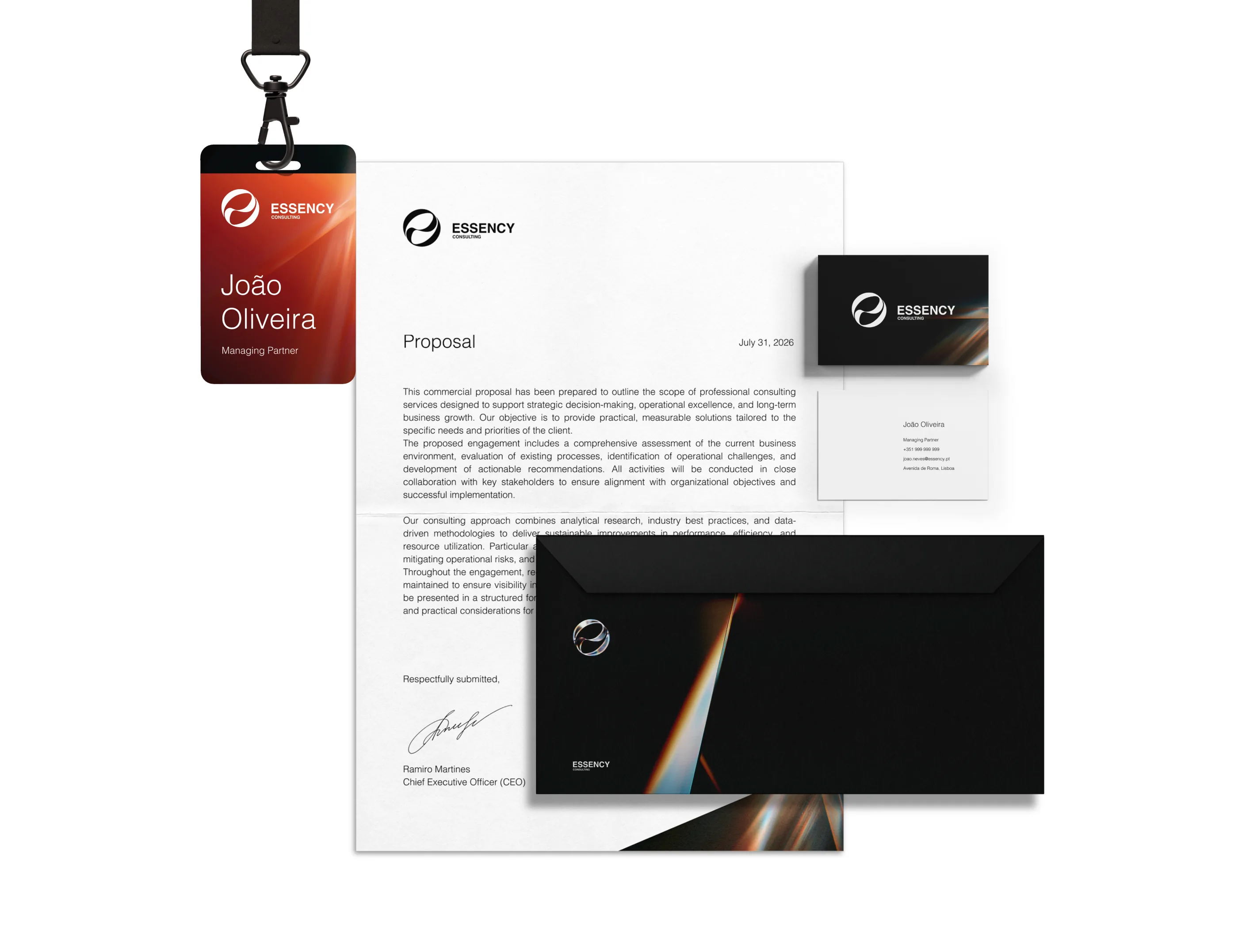
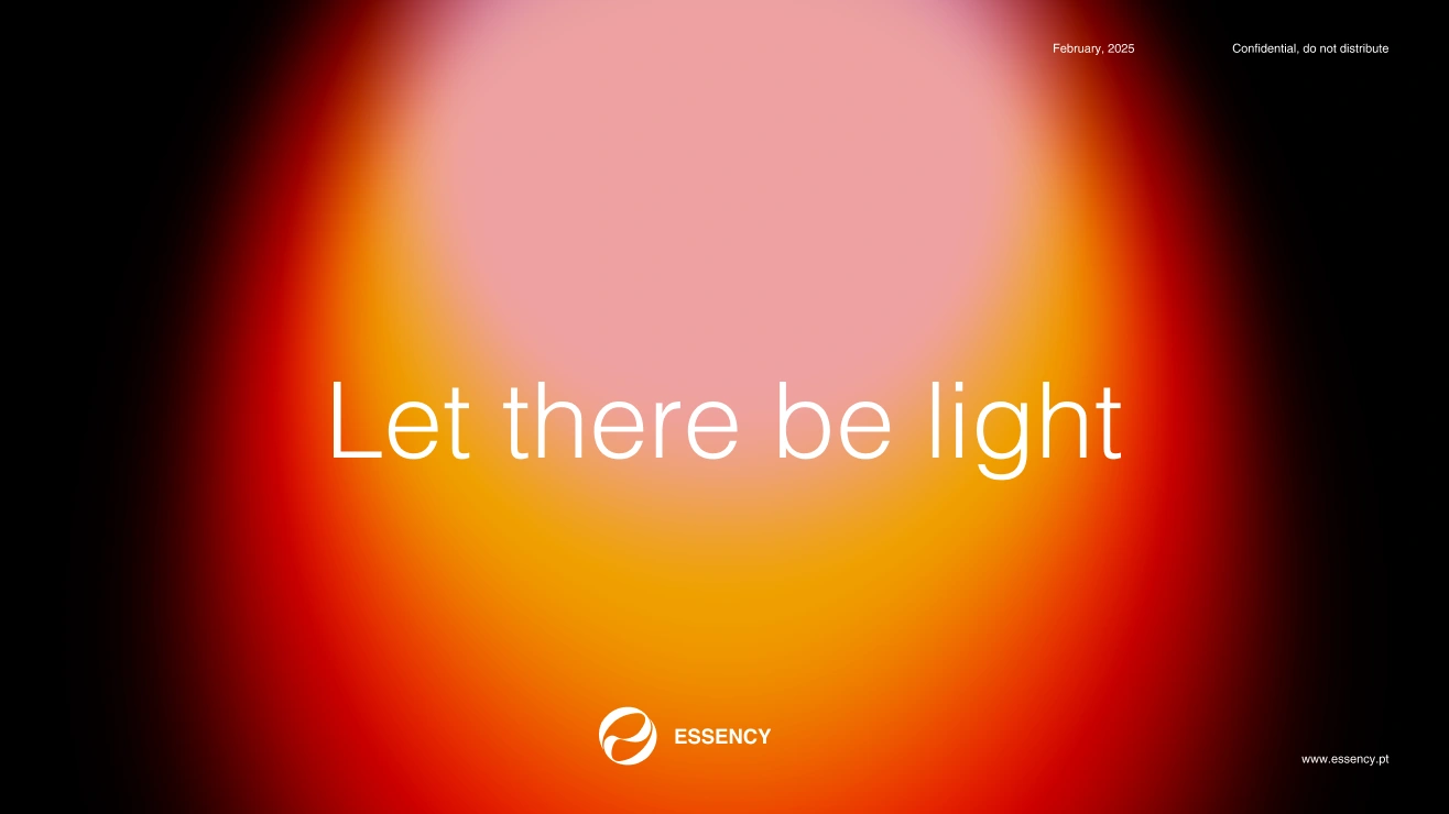
The imagery is built from refracted light and spectrums, and the brand line, Let there be light, casts Essency as the firm that brings clarity. That logic carries off the screen too, into business cards, letterhead, envelopes, and event badges that all run on the same red-on-black system.

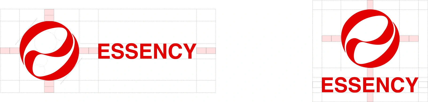
Horizontal and vertical Essency logo lockups with clear-space guides

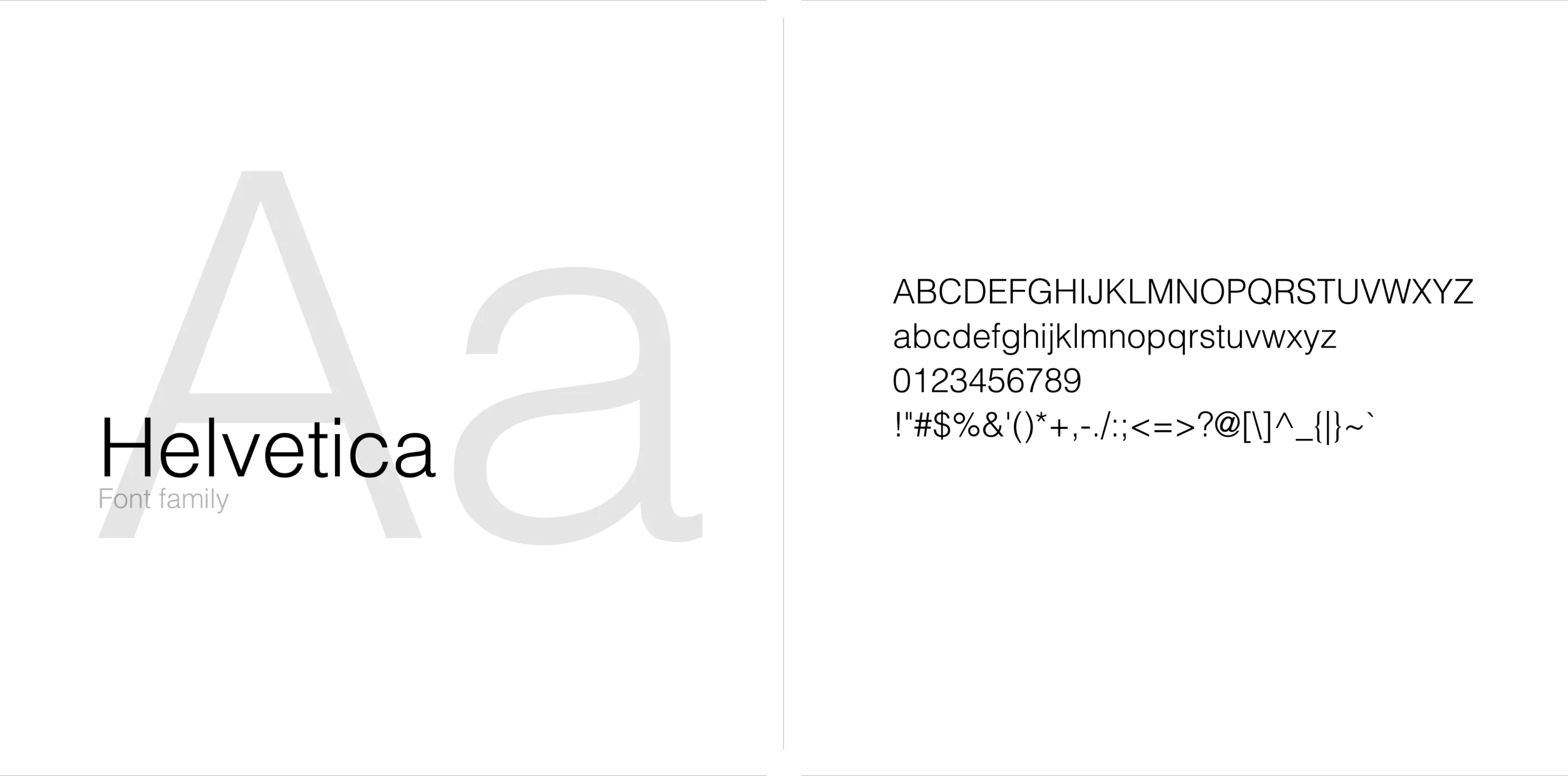
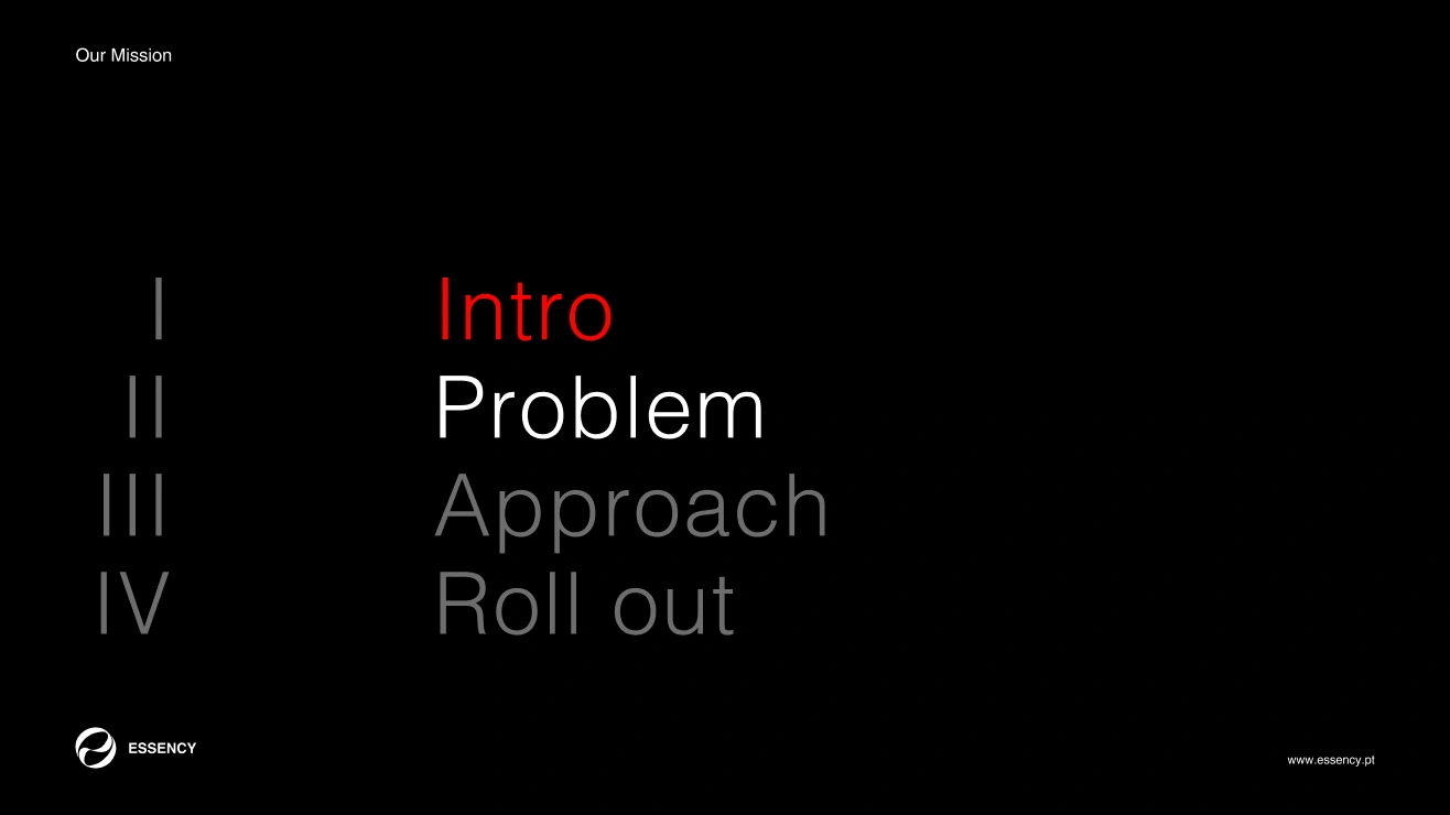
We built direction from a moodboard and a long back-and-forth of references with the client. The final look is minimal — lots of contrast, lots of white space. Helvetica Light does all the typographic work, with size and weight creating hierarchy.

Website

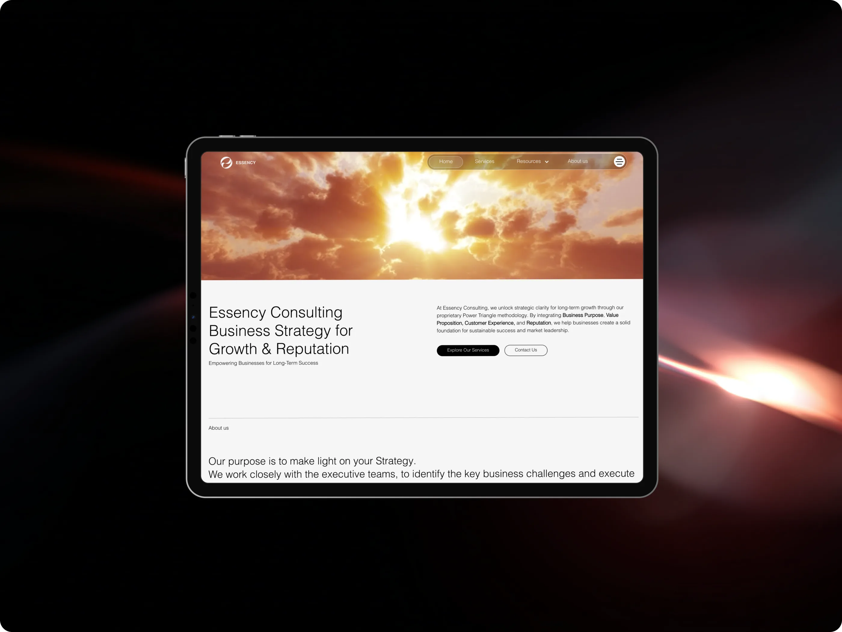
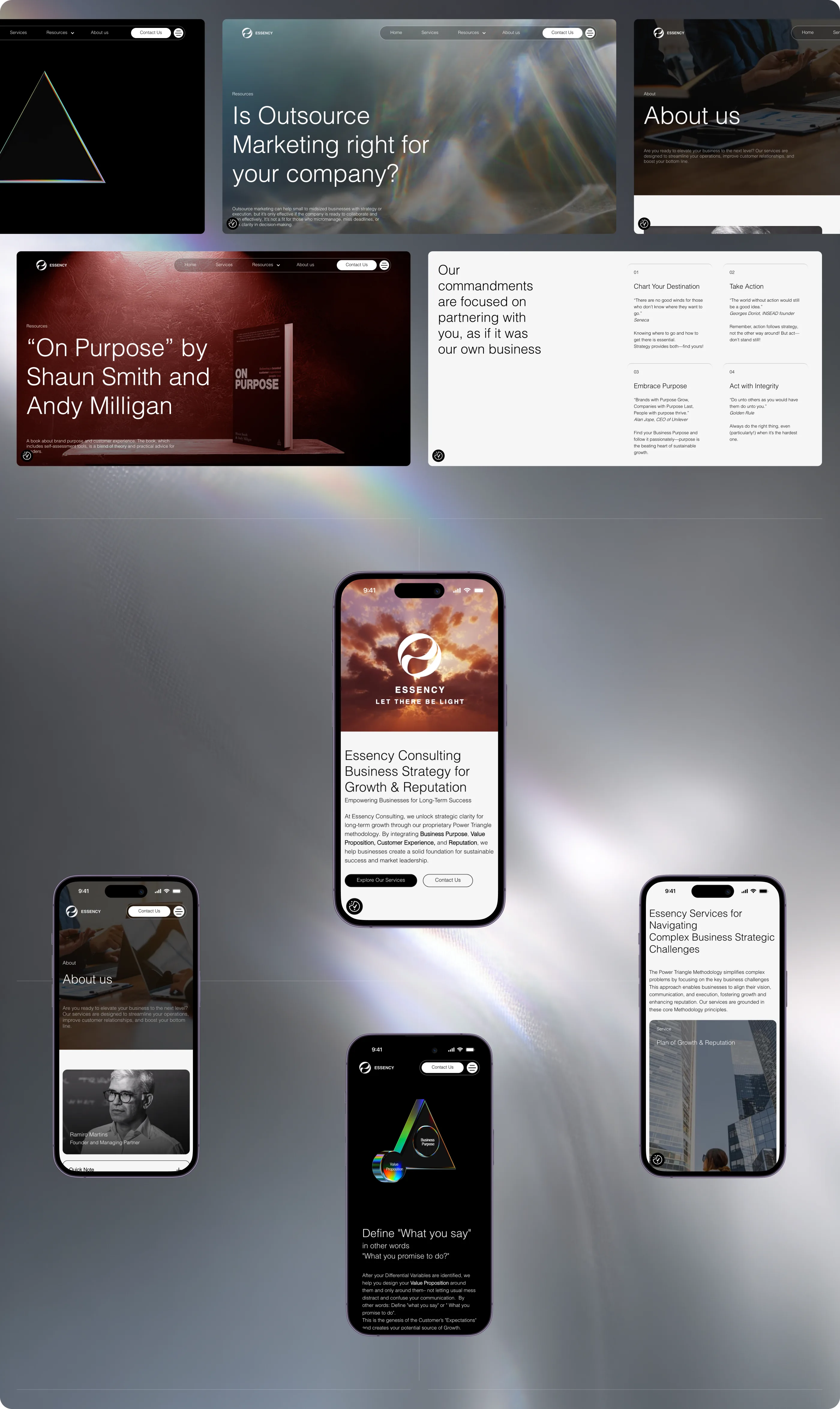
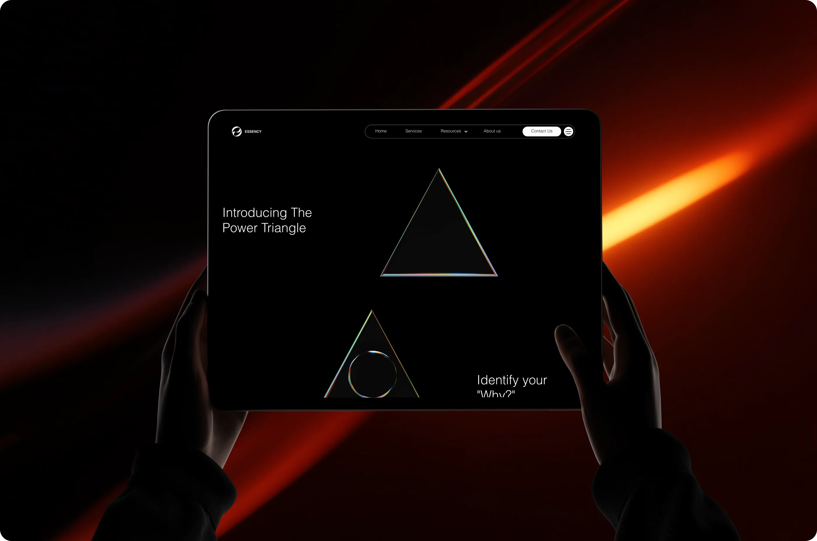
We moved the site from WordPress to a custom Webflow build. The CMS is set up so the Essency team publishes on their own, no developer needed. The build is fully responsive.

This is some text inside of a div block.

Content system and templates

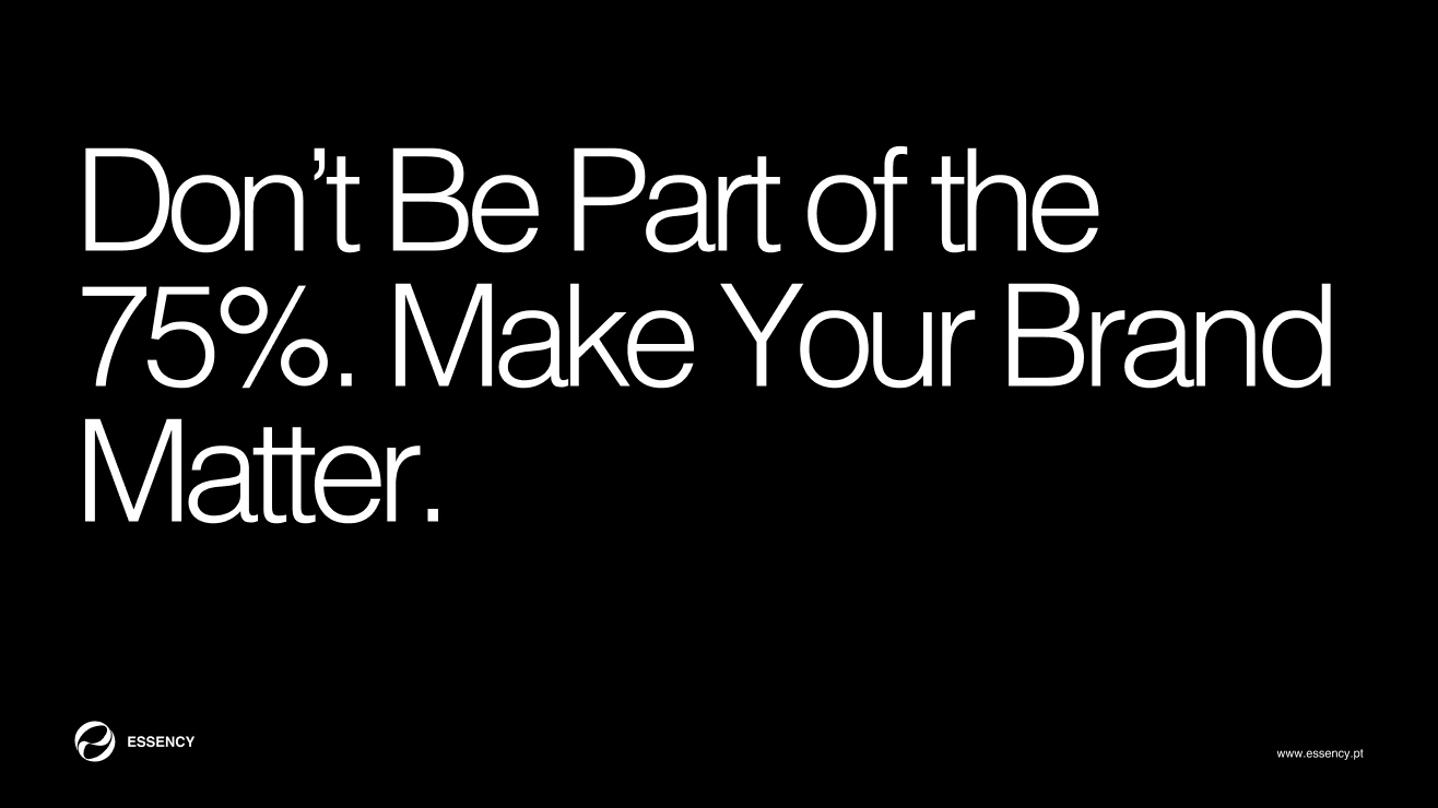
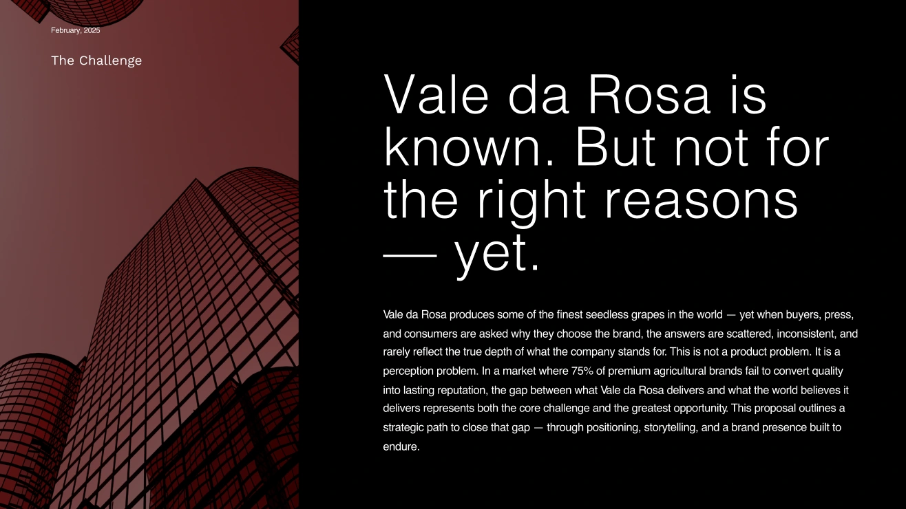
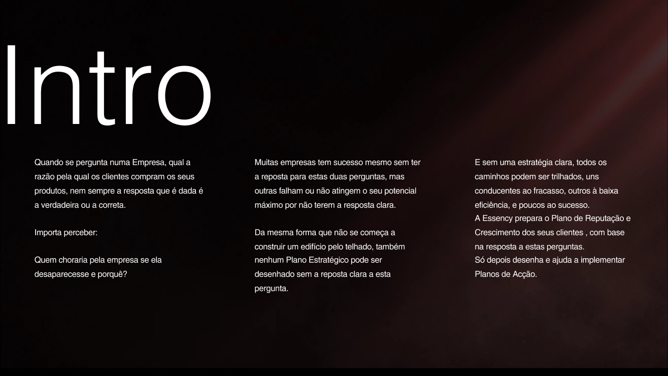
The site connects into the content the team puts out every week. We designed templates for LinkedIn, downloadable resources, and presentation decks, so the same visual language runs across everything the firm publishes.

This is some text inside of a div block.

Outcome

The site relaunched at essency.pt. The team manages everything directly in Webflow; internal updates no longer go through developers. Brand, methodology, and editorial now all run on one system.

A beam of white and blue light cutting diagonally through darkness

Credits

Creative Direction & Strategy: Vladimir Malkov

Brand Identity & Visual Design: Darya Anastasova

Web Design & Webflow Development: Vladimir Malkov, Daniel Petrov

Created by Vast Studio

Created for Essency Consulting

Have a Project Idea?

Book a free strategy session. We review your current site, look at your positioning, check how ready your content is for search and AI discovery, and show where the biggest conversion gaps are.
Strategy and technology by Vast.
Next Case: